Wednesday, March 20, 2013
Exquisite Corps
For my project I chose to do the mad hatter Pokemon character because it stood out to me compared to the other ones. I changed a couple of things like instead of exes on thee body I did stars and I also changed the tale. Since this character kinda reminded me of a mermaid with he tale I decided to make a be achy background for it. There were definitely some difficult parts to this project but I think it came out really well.
Wednesday, March 6, 2013
Logo
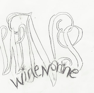
This is the logo I decided to make for my company called "Wine N' Shine." I chose this logo because it was simple and the monogram demonstrated what the company would be designing on the wine glasses. The hardest part about making the monogram was making the "W" since I wanted to have sharp edges and be curvy as well. I chose the color blue because it reminds me of sparkle and went well with Navy for the other words. The logo didn't come out exactly like I would have liked it to but I think it works well for the product.
Logo Sketches
These are some of the different ideas I came up with for my company called "Wine N' Shine." I wanted to do something with wine glasses to show the costumers what they are buying, I also wanted something simple and easy to read. Right now my favorite is the monogrammed logo because it gives an examples of what can be on the different glasses. Also i would be able to put it on glasses as a advertisement.
Monday, March 4, 2013
Caligramme
For this project I wanted to do something that went with the quote "When the sky turns pink it's time for a drink." This is one of my favorite quotes and I thought a martini glass would be a prefect design to who this quote. Although the design is simple I think it is portrayed nicely with the words.
Subscribe to:
Comments (Atom)


